Let’s take a look at the Microsoft logo and the history behind the company. Microsoft is arguably the greatest and most influential software company in the history of the world. It supports the development, manufacture, licensing, and sales of computer software, consumer electronics, personal computers, and services. Microsoft Corporation is an American multinational technology company headquartered in Redmond, Washington. Their global presence is huge, and their product range is amazing.
Without Microsoft, the technology industry would be unfamiliar. The company has paved the way for the personal use of computers and consumer-oriented software. This international business empire is one that will last long in the future due to its strong foundation and ability to adapt to new and changing markets. Along with Google, Apple and Amazon, Microsoft was part of the movement that started a cyber revolution and information age.
Microsoft Logo History and Evolution
Along with Apple and Google, Microsoft is one of the largest and most powerful technology companies in the world today. The Microsoft logo is considered one of the most famous logos in the world. Millions have been printed and advertised on software packages, PCs, laptops, and websites.
Its most well-known software products are Microsoft Windows Line of Operating System, Microsoft Office Suite, and Internet Explorer and Edge Web Browser. Today, we look back over the past 37 years of the evolution of the history of this great company. And how the Microsoft logo has evolved and changed over time.
Read More: Microsoft Surface Dock 2 Latest Products
This becomes even clearer when you look closely at the evolution of the Microsoft logo. And, we will also look at how the company’s message has evolved with the changing status and image of the firm.
Let’s start with Microsoft and its beginnings and how they have become today’s company. And how their logos have changed and adapted to the market over time.
The Hidden Meaning Behind Microsoft’s Official Logo Design
The logo design of the huge software firm Microsoft has been constantly evolving since the company was started in 1975 by “Bill Gates”, a wealthy man we know today.
The current logo is completely different from its previous annoying and straightforward counterparts such as “Rock Star Look”, “Corporate Blibate Look” and “Pack Man Logo Design”.
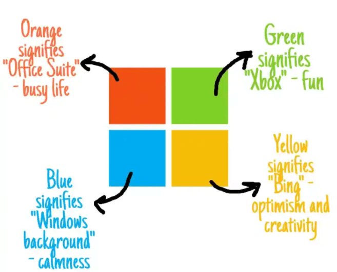
1] Orange signifies Microsoft’s one of the most famous products ever built “Office suite”. It means business and hence a busy life.
2] Green is one of the primary colors of Microsoft’s gaming platform Xbox that signifies fun.
3] Blue resembles the background color you see everywhere on your computer if you have a Windows operating system. It resembles calmness and therefore gives users an eye-soothing experience.
4] Yellow is the original color of Microsoft’s most popular search engine Bing. The color signifies optimism and creativity – the pillars on which Bing is built.
Read More: Microsoft surface charger, Cables & Adapters
A brief history of Microsoft
Microsoft has existed since the beginning of the computer age. Founded in 1975 – a full year before Apple – Bill Gates and Paul Allen began working on their own computer software. By 1975, Microsoft had established itself as one of the most successful software companies ever.
If you’ve ever used Windows Millions or played Minecraft around the world, you’re in the Microsoft ecosystem. After creating their fantastic technology, Microsoft focused on their logo and brand after founding their company. Gates and Allen created the logo themselves. At one point, everyone uses one of their many products, be it Windows, Word, Xbox console, LinkedIn or Skype – just to name a few.
Read More: NVIDIA GeForce GTX 770 Graphics Card Specs
It has become a behemoth with the second largest tech market share of $1.6 trillion and annual revenue of $143 billion. Did you know that Microsoft has been around for almost 40 years? Remember the first company logo or product? Let’s take a look at the bottom of the memory lane and see the different logos of Microsoft.
The name Microsoft comes from two English words, microcomputer and software. Initially, the company wrote its name with a hyphen, but for the version we know today, it quickly disappeared. When you are looking for your company name, be sure to choose something simple!
The original Microsoft logo: 1975 -1980
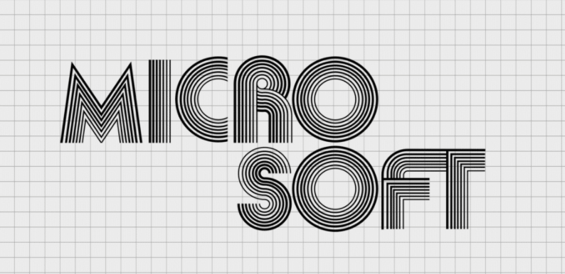
Here comes a new and fun small disco-era start-up called Microsoft. It was 1975 and Harvard drop-out William Gates and his friend Paul Allen chose to pursue their dream of entering the growing world of technology. Their company was officially launched on April 4, 1975, backed by a logo designed by Simon Daniels.
To modern Windows users, this old Microsoft logo is rarely recognized. It was created with the company name in fairly original San Serif font and it well represents the 70’s and the disco year. The typeface of that logo was very similar to the Aki Lines font and looked fresh, stylish and progressive.
Read More: Alienware Aurora 2019 the best gaming PC
It is a monochromatic logo in which all the capital letters are made up of a series of individual lines. Originally, the company name was spelled hyphen as Microsoft. If you look closely you will notice that some lines create a feeling of courage, speed and depth more than others.
Earlier in the day, this logo gave a youthful obsession with its trendy style. Typeface projects a young, progressive sensibility, much of its era, closely related to the Aki Lines font. Rounded letters and large, open ones are consistent with California’s freewheeling policy of the 1970s.
Second Microsoft logo: 1980 – 1982
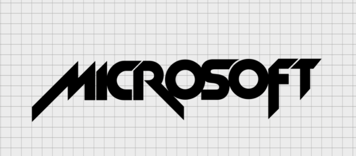
Simon Daniels redesigned the Microsoft logo in 1980, transforming the designer inscription typeface into a sharper and more modern design, with a monochromatic theme. This new brand image seems to be directly inspired by the look of this decade’s heavy metal band. There was only one thing that really stood out from this logo: Microsoft moved on to a word and a line of text.
The five-year-old Microsoft logo has undergone a radical change. It’s reminiscent of a heavy metal band’s album cover. In fact, if you look closely at how M, R, and F extend beyond the outline of the rest of the characters, it looks a lot like the Metallica logo.
In short, it’s important to create a logo with a timeless look so you don’t have to change it as the trend changes! This is one of the top 5 reasons for an overhaul of logos.
Third logo: 1982 – 1987
In 1982, the logo with the affectionate nickname “Blibbet” appeared. Microsoft was moving away from its rocker side to a much more corporate look. First, the company name was in a very common San Serif font. The only thing this logo can detect is the horizontal line of the letter O which looks like a CD.
The first “O” is graphically emphasized in the very center. Thin, small strokes surround it. O was used alone as the company logo. This logo was obviously well-liked by Microsoft employees. They even applied to keep “Blibbet” during the 1987 renewal.
Samuel Daniels also created the No. 3 logo. Apparently, he has reconsidered his approach or the logo could go further in the way of Iron Maiden and KISS.
Fourth logo: 1987 – 2011
In 1987, a recognized and recognizable logo was approved. It had slightly italics written in lowercase letters, except the first, which was capitalized. A slash is visible in the link between “O” and “S”, emphasizing mobility and dynamism in the “soft” part of the word. Scott Baker has created an updated logo.
This logo can still be seen on some software company portals and older products. Specifically, it is still up-to-date on Windows / Microsoft updates and Windows Vista websites, Windows XP boot windows, and Windows XP professional documentation pages.
After all, Microsoft knows most of us and has a love-hate relationship with it. Microsoft’s fourth logo looks a bit sharp, but still quite secure. This version was created by Microsoft designer Scott Baker.
It is a confident, fearless Microsoft logo that fits perfectly with the company’s continued ascent and dominance in the software landscape during that time.
The Current Logo
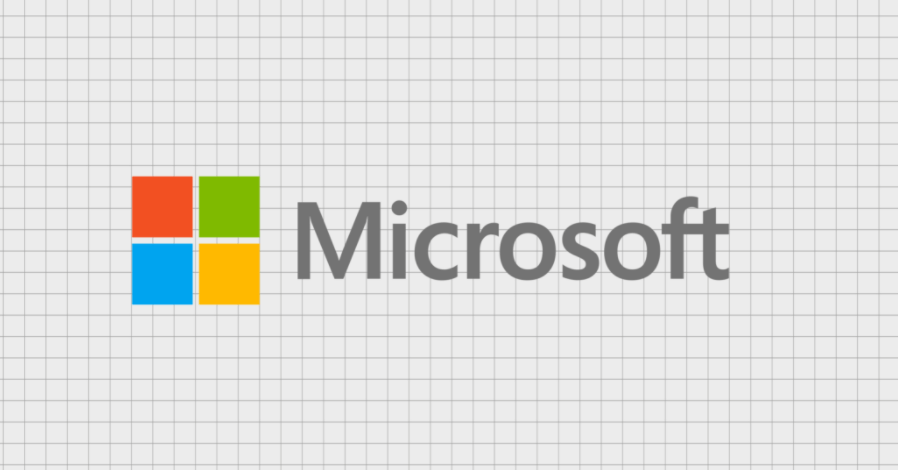
Finally, to this day we’ve come to the end of the evolution of the Microsoft logo, the familiar four-color window next to the word Microsoft in the Segoe UI font. After 45 years of logo history, it looks like the new Microsoft logo will be around for a while.
The square symbol represents the various products of Microsoft. A major change in the Microsoft logo took place in 2012. Four squares of different colors create a window that is clearly reminiscent of Windows – one of the company’s most important products.
According to some, the red square represents a PowerPoint or office suite. Blue square for Word or Windows. Green squares for Xbox or Excel consoles and yellow squares for Outlook or Bing.
Not only does the addition of a colorful windowpane distinguish it from the rest of the old Microsoft logo, but it is also a dramatic change in the decades-old Microsoft logo design, softening the font in the round Segoe UI.
Conclusion
In conclusion, why not ask your friends or staff for help when creating your logo? They will definitely help you or give you constructive feedback. As you have seen in this article, it can be tempting to follow trends when creating your logo. But it is better to choose something indefinite!
Do you need to make your own iconic logo or replace an outdated version with something more professional and relevant? Check out logo maker and we will help you make the process easy.